Posts

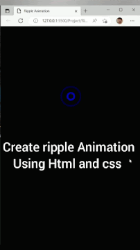
Loding Animation Using HTML and CSS

Image
 How to create Loading animation Preview:                Click and Watch :  Loding Animation HTML: <! DOCTYPE html > < html >     < head >         < title > Loading animation </ title >     </ head >     < body >         < div class = "loading" >             < span > L </ span >             < span > O </ span >             < span > A </ span >             < span > D </ span >             < span > I </ span >             < span > N </ span >             < span > G </ span >             < span > . </ span >             < span > . </ span >         </ div >     </ body >   </ html > CSS:             * {                 margin : 0 ;                 padding : 0 ;                 font-family : sans-serif ;             }             body {                 background : #000 ;                 color : #fff ;    

Hover Animation On Button

Image
 How to create hover animation on Button lets learn Preview:                    Click & Watch:  Hover On Button HTML: <!DOCTYPE html> <html> <head>     <title>Hover Button</title> </head> <body> <a href="#" class="btn">Hover Me</a> </body> </html> CSS:         body{             background: #000;         }         .btn{             position: absolute;             top: 50%;             left: 50%;             transform: translate(-50%,-50%);             text-decoration: none;             font-size: 18px;             padding: 20px 60px;             color: #fff;         }         .btn::before, .btn::after{             content: '';             width: 100%;             height: 100%;             position: absolute;             top: 0;             left: 0;             box-sizing: border-box;             transition: top 0.5s,left 0.5s;         }         .btn::before{             border-left: 2px sol

CSS Neon Effect | CSS Hover Animaton

Image
 How to crate CSS Neon effect Button using Html and CSS? Preview:          Click and watch:  Css Neon Effect HTML: <! DOCTYPE html > < html >     < head >         < title > Hover animation </ title >     </ head >     < body >         < h1 class = "btn" > Mxgk99 </ h1 >     </ body > </ html > CSS:         body {             font-family : sans-serif ;             background : #000 ;         }         .btn {             color : #fff ;             border : 4px solid #fff ;             padding : 30px 70px ;             width : fit-content ;             margin : 200px auto ;             font-size : 50px ;             font-style : italic ;             transition : text-shadow 1s ,box-shadow 1s ;         }         .btn:hover {             text-shadow : -2px -2px 10px #fff ,               2px 2px 10px #fff ,               0 0 20px #f10 ,               0 0 40px #f10 ,               0 0 60px #f10

CSS ripple Animation | How to create Ripple Animation Using Html and Css

Image
  Create Netflix Logo Using Html and css - Mxgk99 Preview:  Click and Watch:   Css ripple Animation HTML: <! DOCTYPE html > < html >     < head >         < title > Ripple Animation </ title >     </ head >     < body >         < div class = "ripple" >             < div ></ div >             < div ></ div >         </ div >     </ body > </ html > CSS:   body {             background : #000 ;         }         .ripple {             width : 100px ;             height : 100px ;             margin : 200px auto ;             position : relative ;         }         .ripple div {             position : absolute ;             top : 50% ;             left : 50% ;             transform : translate ( -50% , -50% );             border : 6px solid blue ;             animation : ripple 1s cubic-bezier ( 0.3 , .54 , .6 , .63 ) infinite ;             border-radius : 50% ;         }         .rippl

Spin Text On Mouse Hover - Mxgk99

Image
Spin Text On Mouse Hover Pure Html &Css.  Preview: HTML: <! DOCTYPE html > < html > < head >     < title > Spin Text </ title >     < link rel = "stylesheet" type = "text/css" href = "Style.css" > </ head > < body > < ul >     < li > M </ li >     < li > X </ li >     < li > G </ li >     < li > K </ li >     < li > 9 </ li >     < li > 9 </ li > </ ul > </ body > </ html > CSS: * {     margin : 0 ;     padding : 0 ;     background : #ff008b ; } ul { padding : 50px ; margin : 0 ; border : 10px solid #fff ; display : inline-block ; position : absolute ; top : 50% ; left : 50% ; transform : translate ( -50% , -50% ); } ul li {     list-style : none ;     color : #fff ;     float : left ;     font-size : 5em ;     font-family : "arial" ;     transition : .9s ; } ul:hover li {     transform : rota

Gradient Image Border Using Html & Css

Image
  How to  Cr eate Gradient Border Around the image when hover using HTML And CSS | Html & Css का उपयोग करके फोटो के चारों तरफ  Gradient Border  कैसे बनाए ।  Preview:            Click to Watch:  Gradient Image Border Using Html & Css HTML: <! DOCTYPE html > < html > < head >     < title > Gradient Border </ title > </ head > < body >     < img src = "Image\User-image.jpg" > </ body > </ html > CSS: body {             background-color : #000 ;         }         img {             width : 150px ;             border-radius : 50% ;             position : absolute ;             top : 50% ;             left : 50% ;             transform : translate ( -50% , -50% );             padding : 8px ;             background : linear-gradient ( 135deg , red , blue , 50% , transparent 50% );             background-size : 250% ;             background-position : 100% 100% ;             transition : background 0.5s ;