CSS Neon Effect | CSS Hover Animaton
How to crate CSS Neon effect Button using Html and CSS?
Preview:

Click and watch: Css Neon Effect
HTML:
<!DOCTYPE html>
<html>
<head>
<title>Hover animation</title>
</head>
<body>
<h1 class="btn">Mxgk99</h1>
</body>
</html>
CSS:
body{
font-family:sans-serif ;
background: #000;
}
.btn{
color: #fff;
border: 4px solid #fff;
padding: 30px 70px;
width: fit-content;
margin: 200px auto;
font-size: 50px;
font-style: italic;
transition: text-shadow 1s ,box-shadow 1s;
}
.btn:hover{
text-shadow:-2px -2px 10px #fff,
2px 2px 10px #fff,
0 0 20px #f10,
0 0 40px #f10,
0 0 60px #f10,
0 0 80px #f10,
0 0 100px #f10;
box-shadow: 0 0 5px #fff,
inset 0 0 5px #fff,
0 0 20px #08f,
inset 0 0 20px #08f,
0 0 40px #08f,
inset 0 0 40px #08f;
}
Some Useful Link:
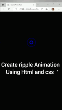
- How to create ripple Animation
- How to create Spin Text On Mouse Hover
- How to create gradient Border on Mouse Hover

Comments
Post a Comment