Loding Animation Using HTML and CSS
How to create Loading animation
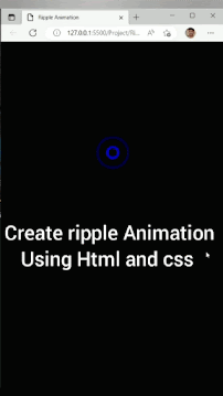
Preview:

Click and Watch : Loding Animation
HTML:
<!DOCTYPE html>
<html>
<head>
<title>Loading animation</title>
</head>
<body>
<div class="loading">
<span>L</span>
<span>O</span>
<span>A</span>
<span>D</span>
<span>I</span>
<span>N</span>
<span>G</span>
<span>.</span>
<span>.</span>
</div>
</body>
</html>
CSS:
*{
margin: 0;
padding: 0;
font-family: sans-serif;
}
body{
background: #000;
color: #fff;
}
.loading{
width: fit-content;
margin: 30% auto 0;
}
.loading span{
display: inline-block;
padding: 2px;
font-size: 50px;
transform: translateY(70px);
animation: moveup 3s linear infinite;
}
@keyframes moveup {
0%{
transform: translateY(70px);
}
20%{
transform: translateY(0px);
}
100%{
transform: translateY(0px);
}
}
.loading span:nth-child(2){
animation-delay: 0.2s;
}
.loading span:nth-child(3){
animation-delay: 0.4s;
}
.loading span:nth-child(4){
animation-delay: 0.6s;
}
.loading span:nth-child(5){
animation-delay: 0.8s;
}
.loading span:nth-child(6){
animation-delay: 1s;
}
.loading span:nth-child(7){
animation-delay: 1.2s;
}
.loading span:nth-child(8){
animation-delay: 1.4s;
}
.loading span:nth-child(9){
animation-delay: 1.6s;
}
Some Useful Links:

Comments
Post a Comment